
KFW 2026
Branding
2026

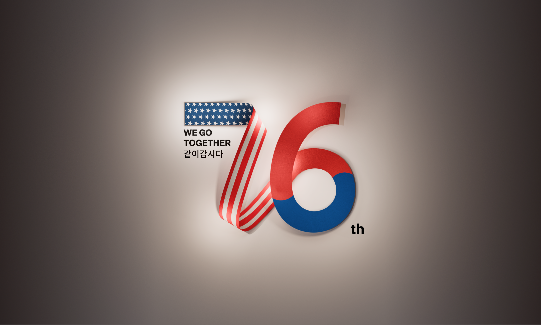
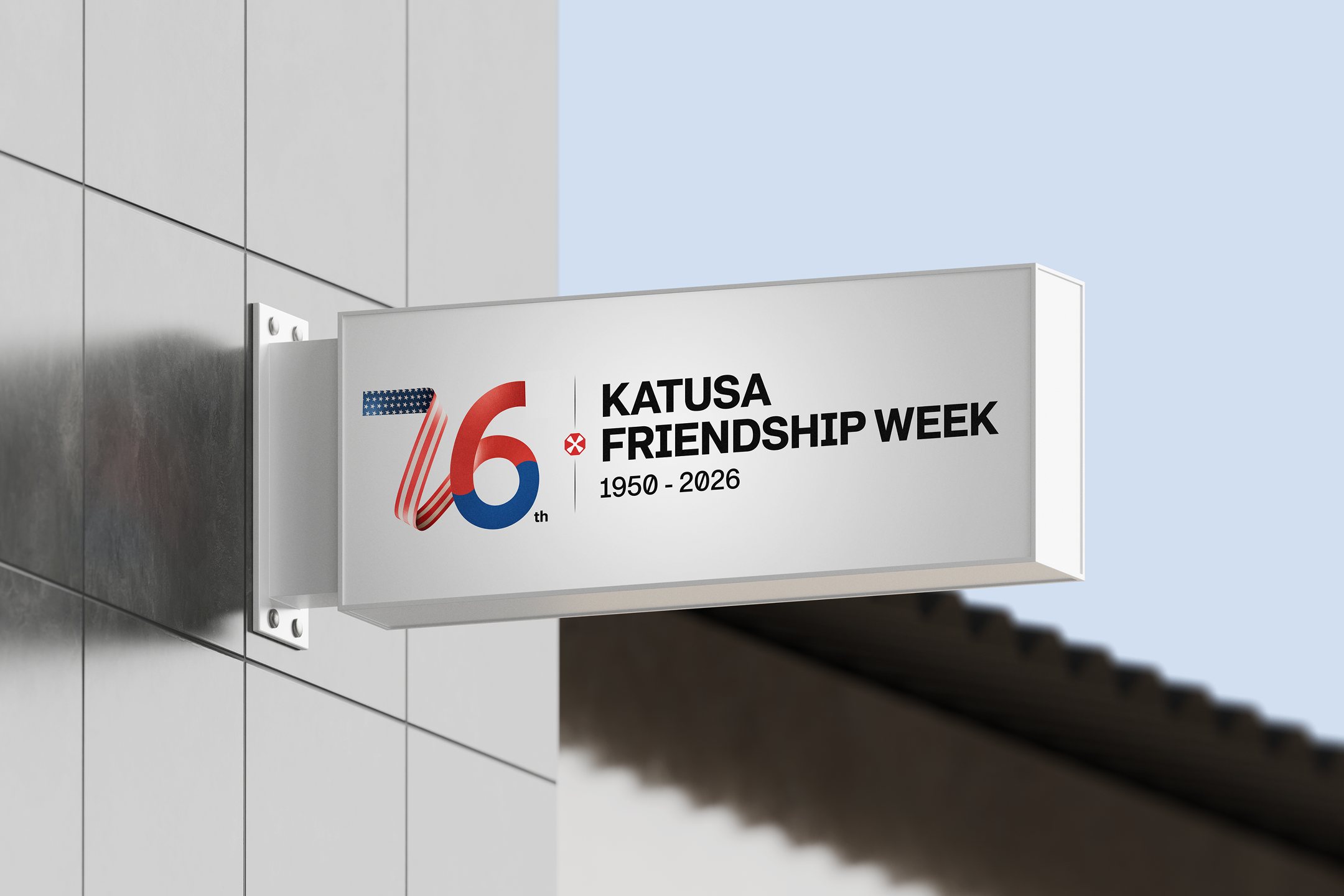
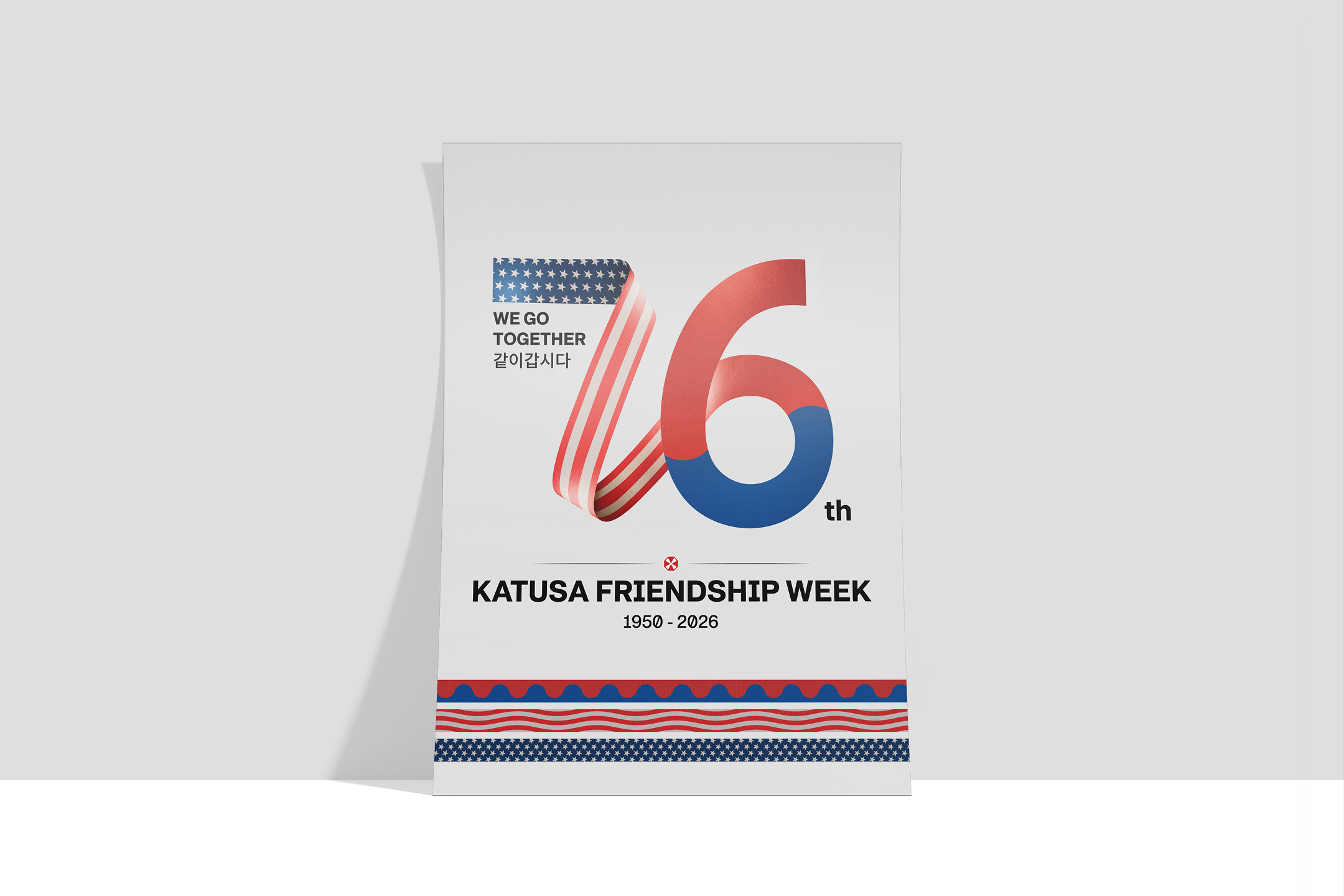
Forged in the crucible of 1950, the history of KATUSA now spans 76 years.
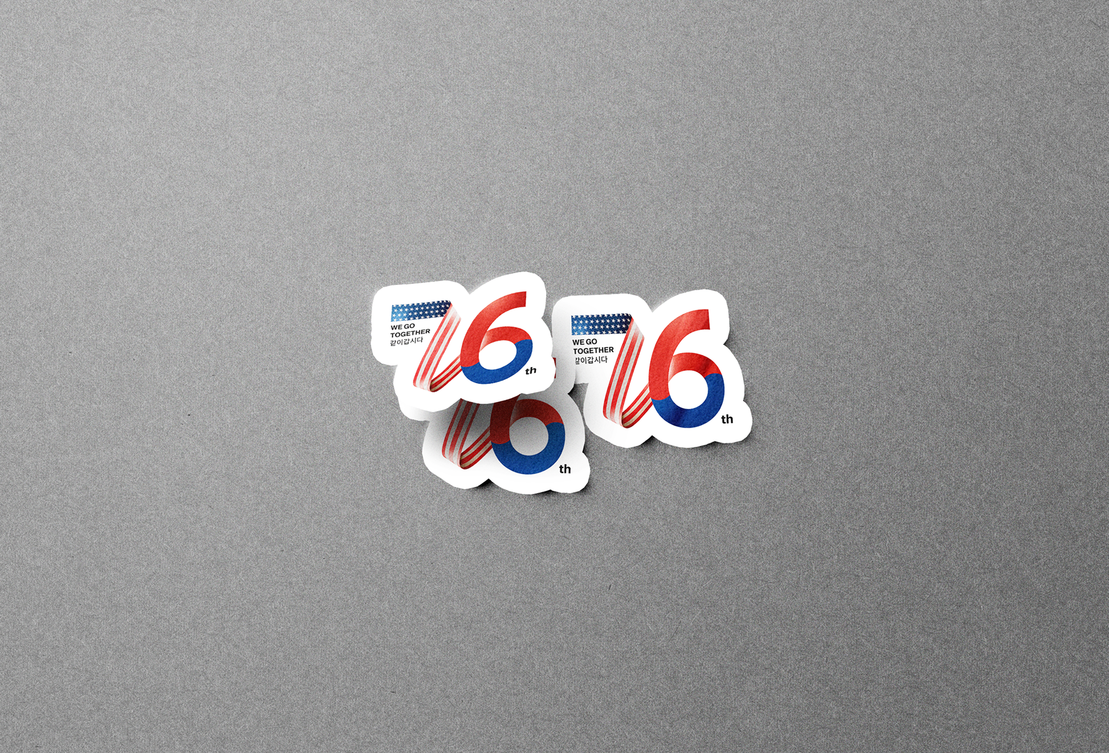
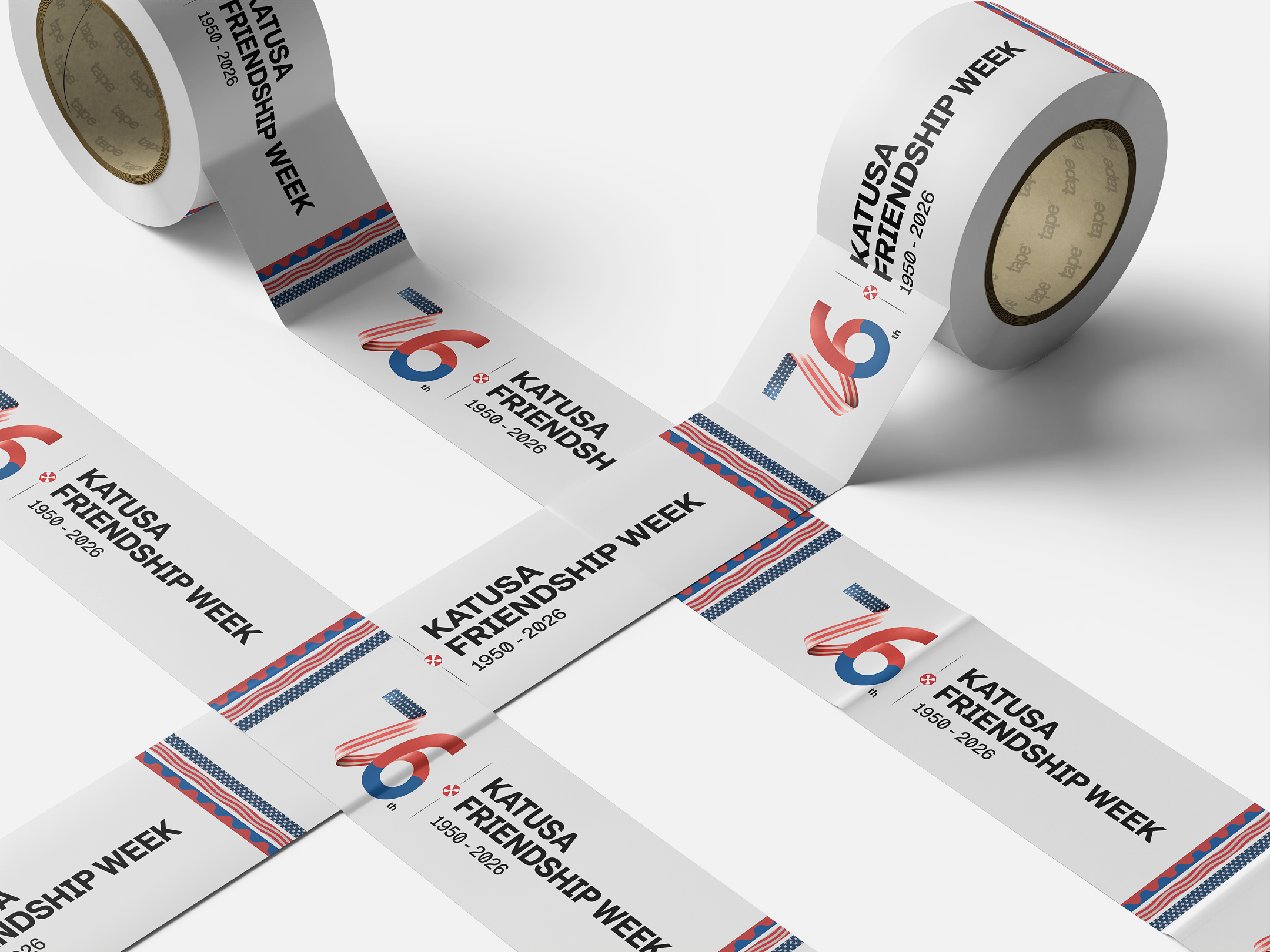
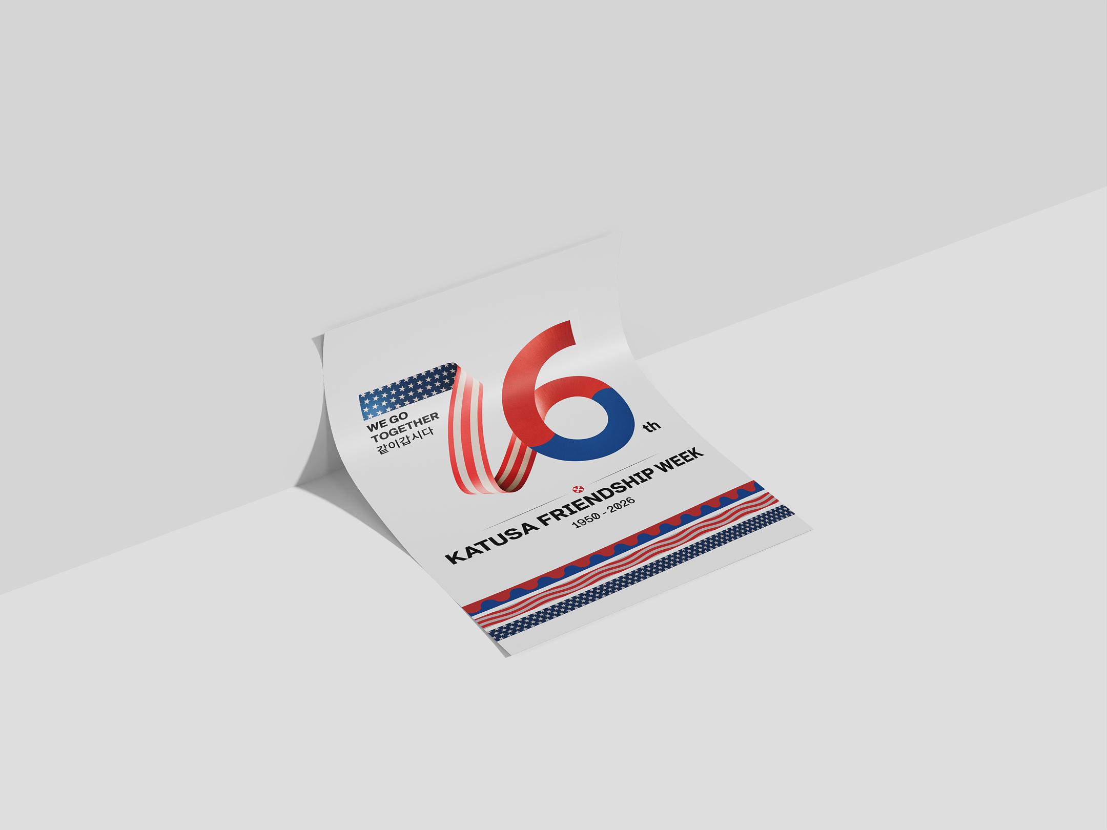
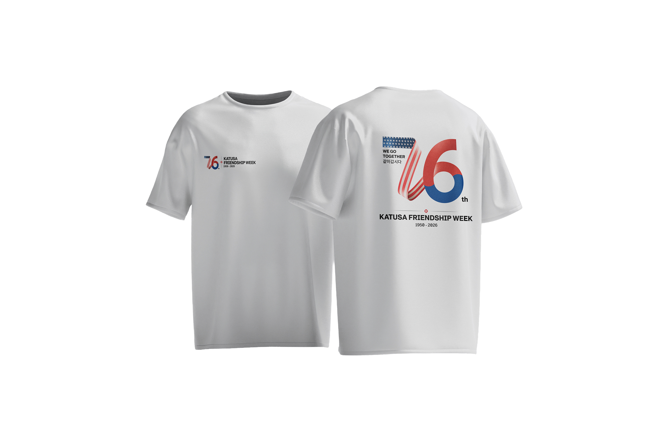
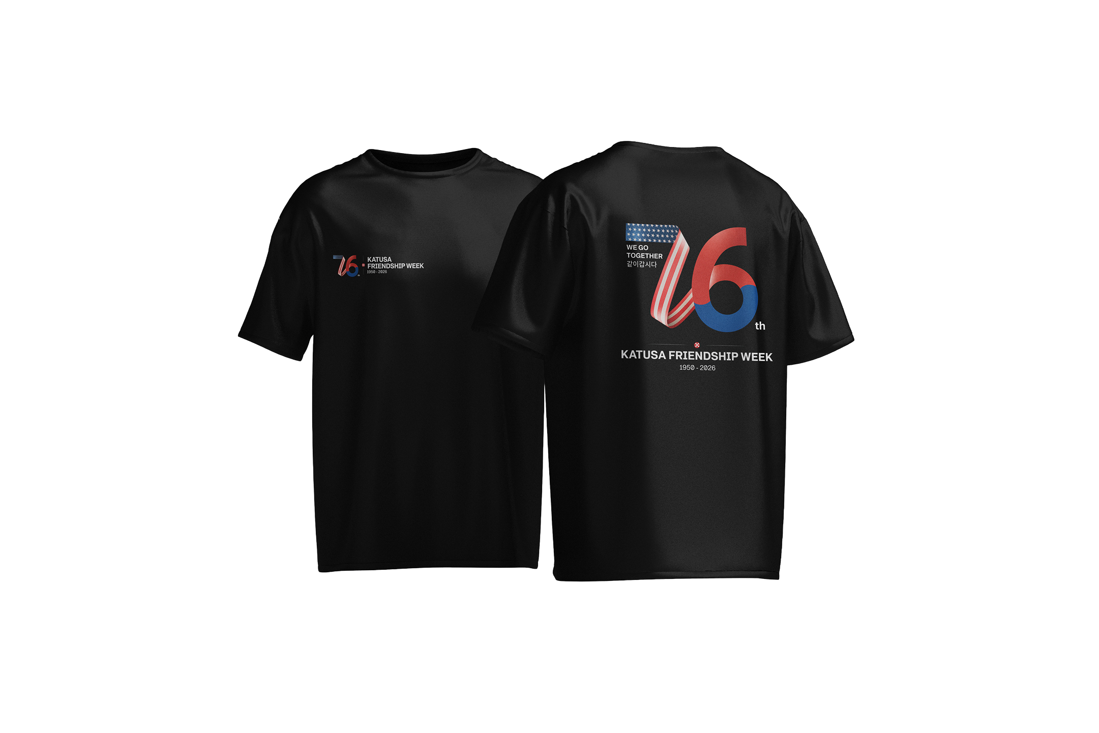
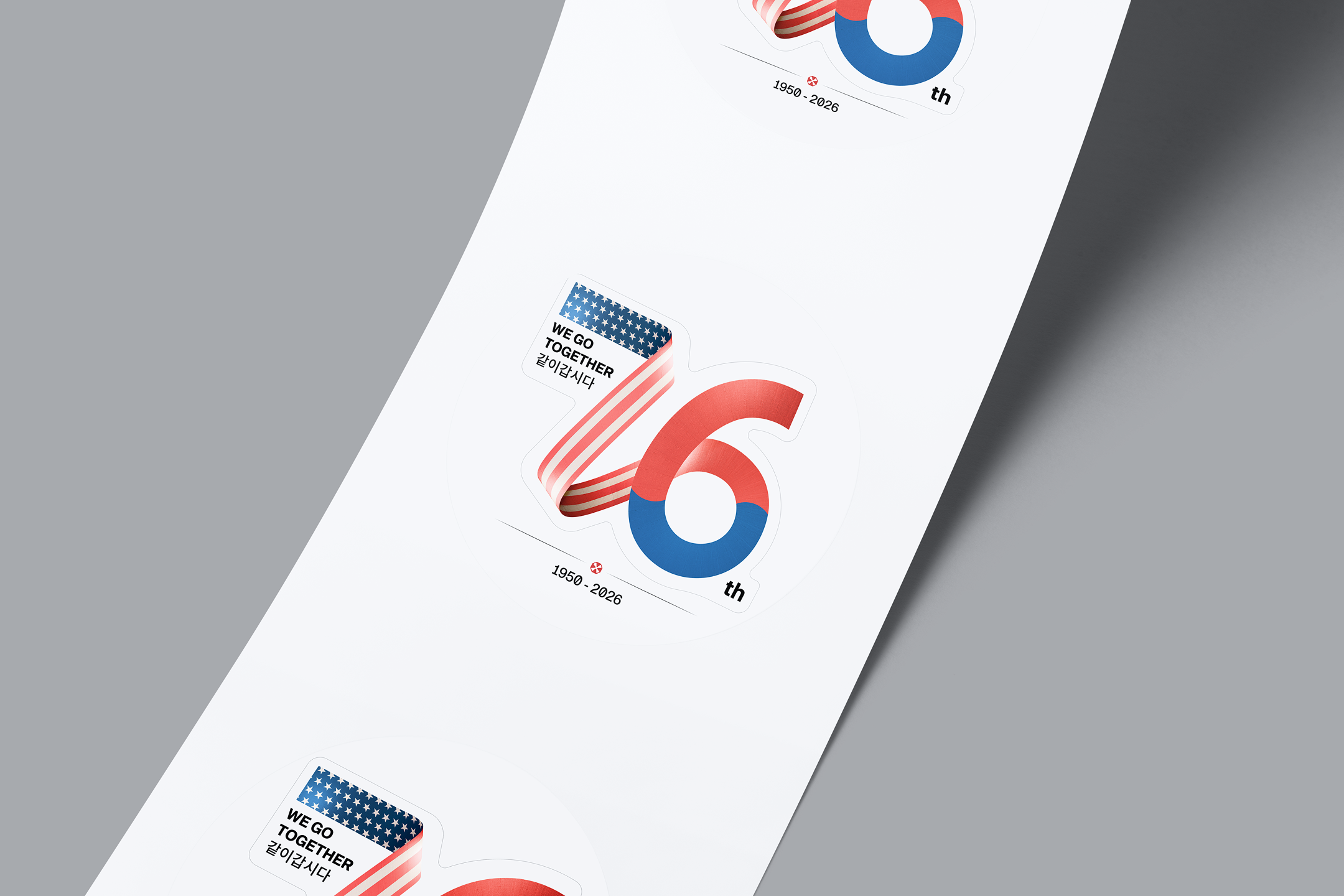
The KFW 2026 logo embodies this profound legacy, visualized as ribbons bearing the patterns of the Stars and Stripes and the Taegeuk seamlessly connecting to form the number '76'.
This continuous, flowing ribbon is more than a commemoration; it symbolizes the enduring bond of the ROK-US Alliance, built upon past devotion and destined to continue into the future.
1950년 포화 속에서 시작된 카투사의 역사가 어느덧 76주년을 맞이했습니다.
KFW 2026 로고는 이 깊은 유산을 성조기와 태극 문양의 리본이 하나로 연결되어 숫자 '76'을 완성하는 모습으로 형상화했습니다.
끊어짐 없이 흐르는 이 리본은 단순한 기념을 넘어, 과거의 헌신을 바탕으로 미래를 향해 계속해서 이어질 한미동맹의 영원한 유대를 상징합니다.


The KFW 2026 symbol is designed based on the numeral '76,' commemorating the 76th anniversary of the ROK-US Alliance. The design visually deconstructs and reconfigures elements from both national flags into a modern graphic language.
KFW 2026의 심볼은 한미동맹 76주년을 기념하기 위해, 양국 국기의 조형적 요소를 현대적인 그래픽 언어로 해체하고 재조합하여 설계되었습니다.
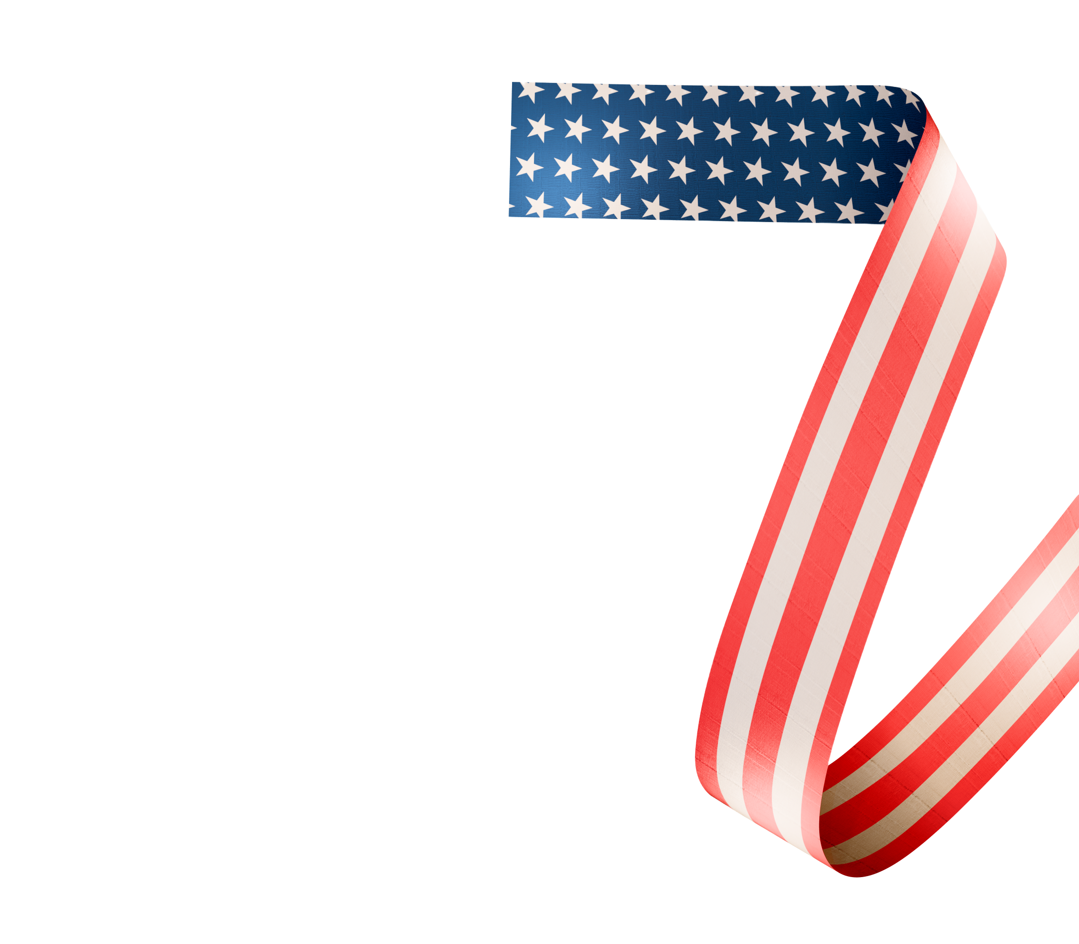
The Stars and Stripes
The numeral '7' utilizes its structural characteristic of straight lines to incorporate visual elements of the U.S. flag.
The Canton (the blue field with stars) is placed on the top horizontal stroke to establish a strong visual starting point.
The diagonal vertical stroke features the Stripes pattern of alternating red and white.
This approach reinterprets the flag’s inherent linear rhythm, allowing it to flow naturally along the extended stroke of the number '7'.
숫자 '7'은 직선이 강조되는 조형적 특성에 착안하여, 성조기의 시각적 요소를 재조합했습니다.
'7'의 상단 가로획에는 성조기의 캔턴(청색 바탕의 별) 요소를 배치하여 시작점을 견고하게 잡았으며, 아래로 시원하게 뻗어 나가는 대각선 세로획에는 붉은색과 흰색이 교차하는 스트라이프(Stripes) 패턴을 적용했습니다.
성조기가 가진 선형적인 리듬감(Linear Rhythm)을 숫자 '7'의 획을 따라 자연스럽게 흐르도록 재구성 했습니다.
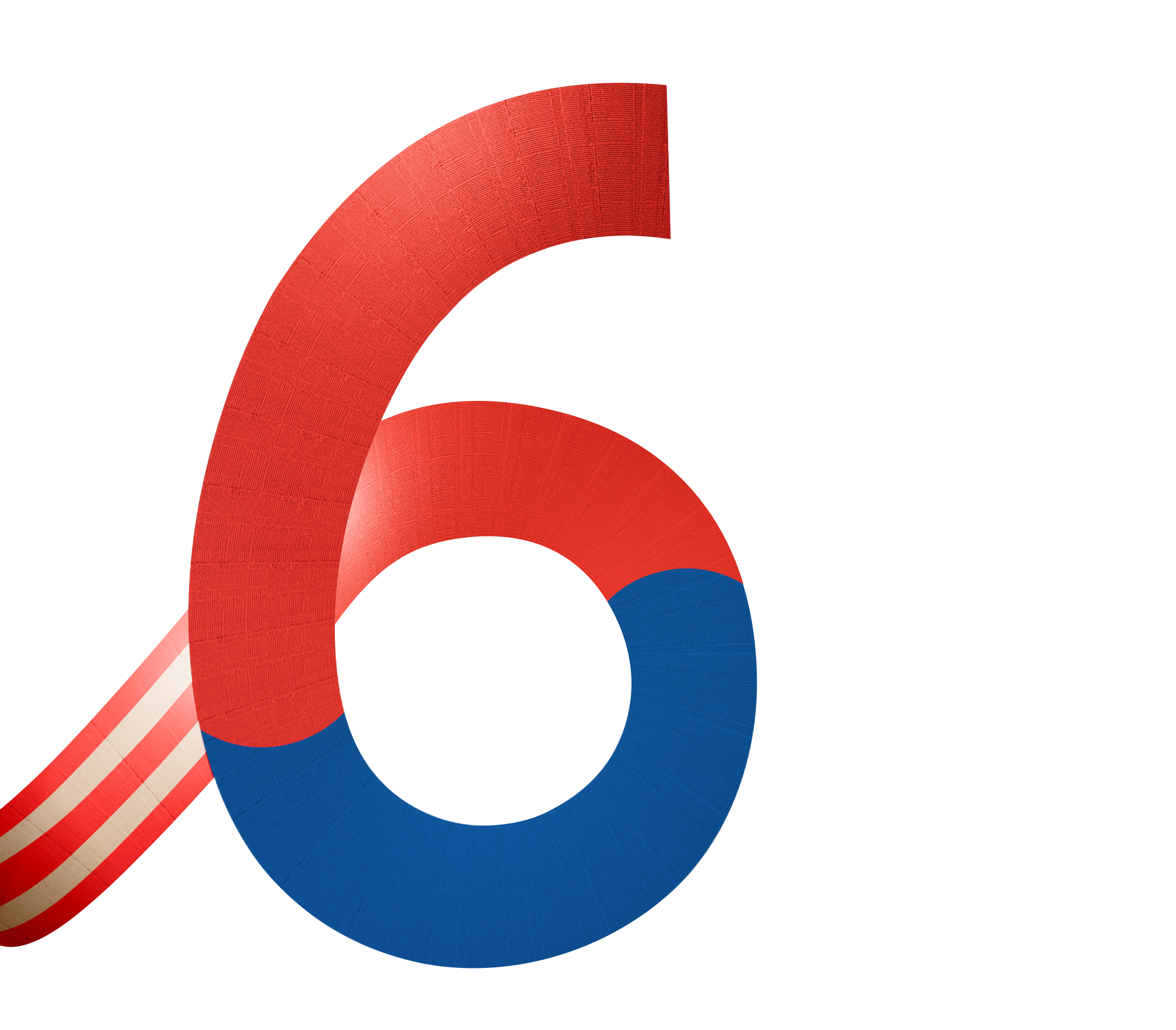
The 'Taegeuk'
The numeral '6' leverages its curvilinear form to embody the Taegeuk Mark of the South Korean flag.
The fluid curve that winds inward from the bottom bowl of the '6' perfectly mirrors the dynamic aesthetic of the Taegeuk, representing the harmony of red and blue.
This visualizes the organic integration of the traditional Taegeuk curve within the modern typographic form.
숫자 '6'은 둥글게 감기는 곡선의 형태적 특징을 활용하여, 대한민국 국기의 태극 문양(Taegeuk Mark)을 투영했습니다.
'6'의 하단 볼(Bowl) 부분에서 시작되어 안쪽으로 회전하는 유려한 곡선은 청색과 홍색의 음양 조화를 상징하는 태극의 조형미와 완벽하게 일치합니다.
이를 통해 태극 고유의 역동적인 곡선을 숫자의 형태 속에 유기적으로 녹여냈습니다.
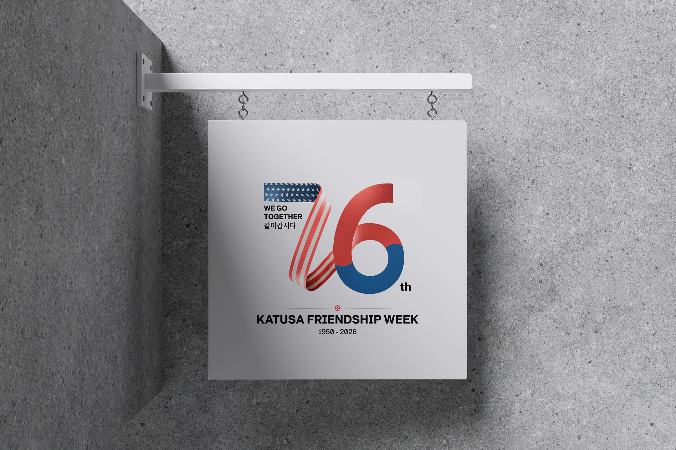
2026.01 - 2026.06